Pliable: Bag as Billboard
Type: Bag Design & ProductionYear: 2017
This design of the bag manifests itself only on the surface, arguing that in the construction of a bag, without the need for three-dimensional extrusions, depth, or filling, the design can still implement pliable relationships between surface and form.
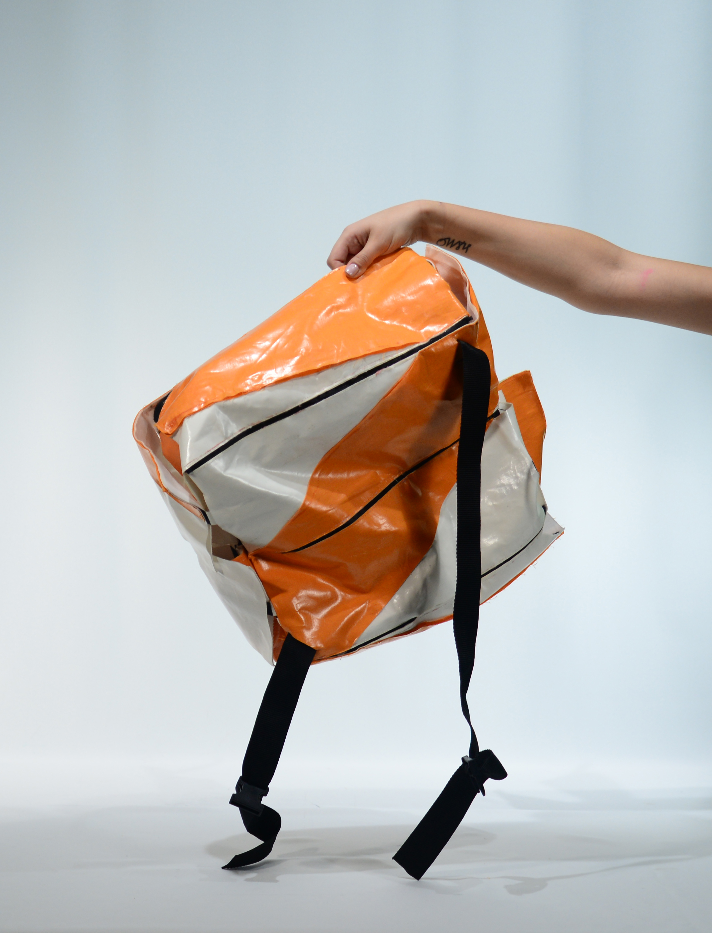
The choice of letters as the graphic upon the simple surface of a “box” is integral to the part-to-whole relationships that are aimed to be constructed in this design. The familiarity of whole letters facilitates the spectators to understand where the cut has been made as the letters used upon the bag represent only a portion of a “known” letter. The incentive behind cutting the letter is to explore the graphic quality of a linguistic element.
Letters are made out of the most basic and elemental components of a drawing: straight lines, diagonals, curves. Once taken advantage of this inherent geometric potential, letters, with tons of typefaces to choose from, enable elegant, bold, and compositional graphic. Once cut, they are freed from their expected quality that one can easily dismiss the geometric composition due to its familiarity and quick association.
Being exposed to only a portion of the letter forces the spectator to pay attention to its geometry and graphic quality.
In all these ways, the bag becomes a billboard. It is flat, bold, and large.
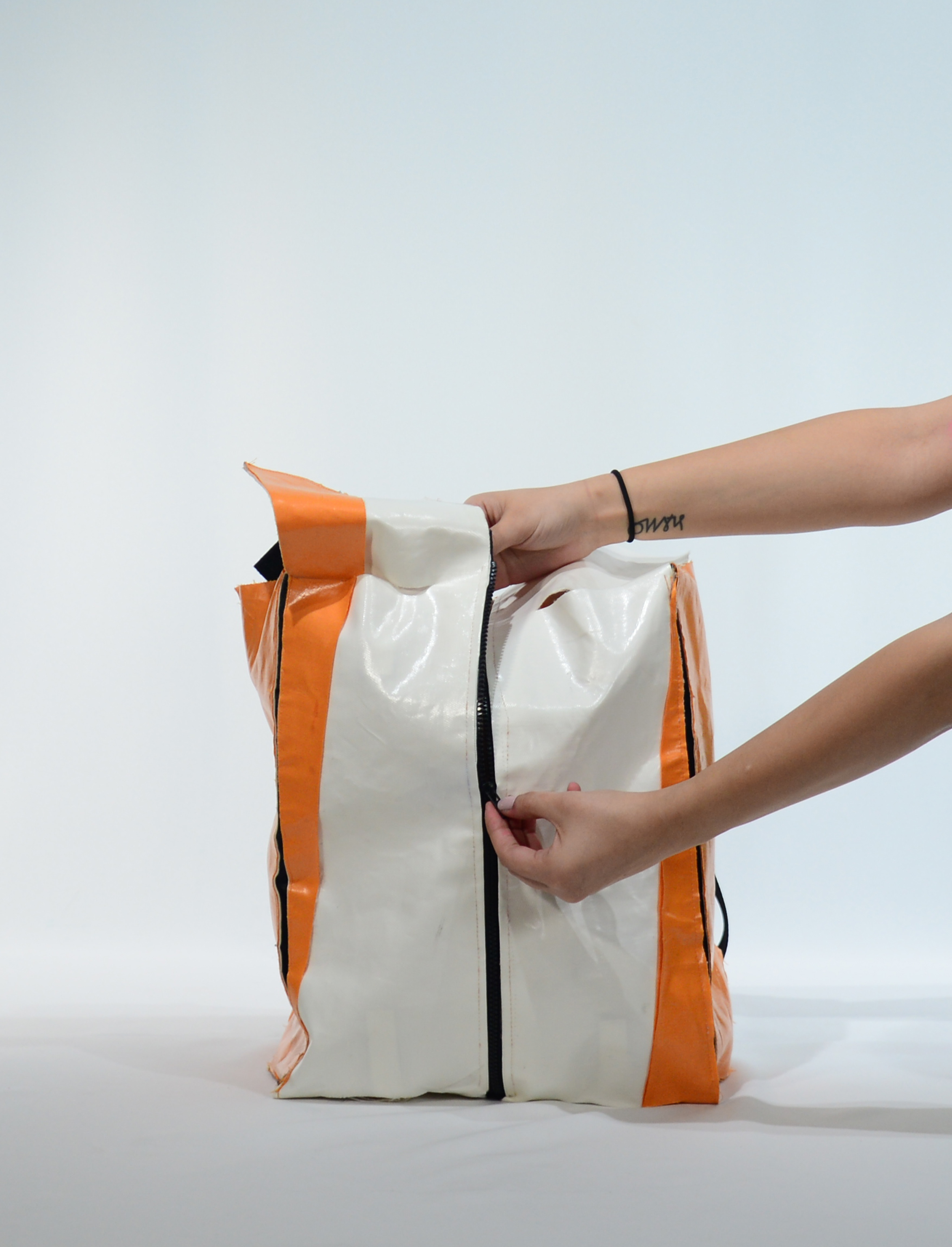
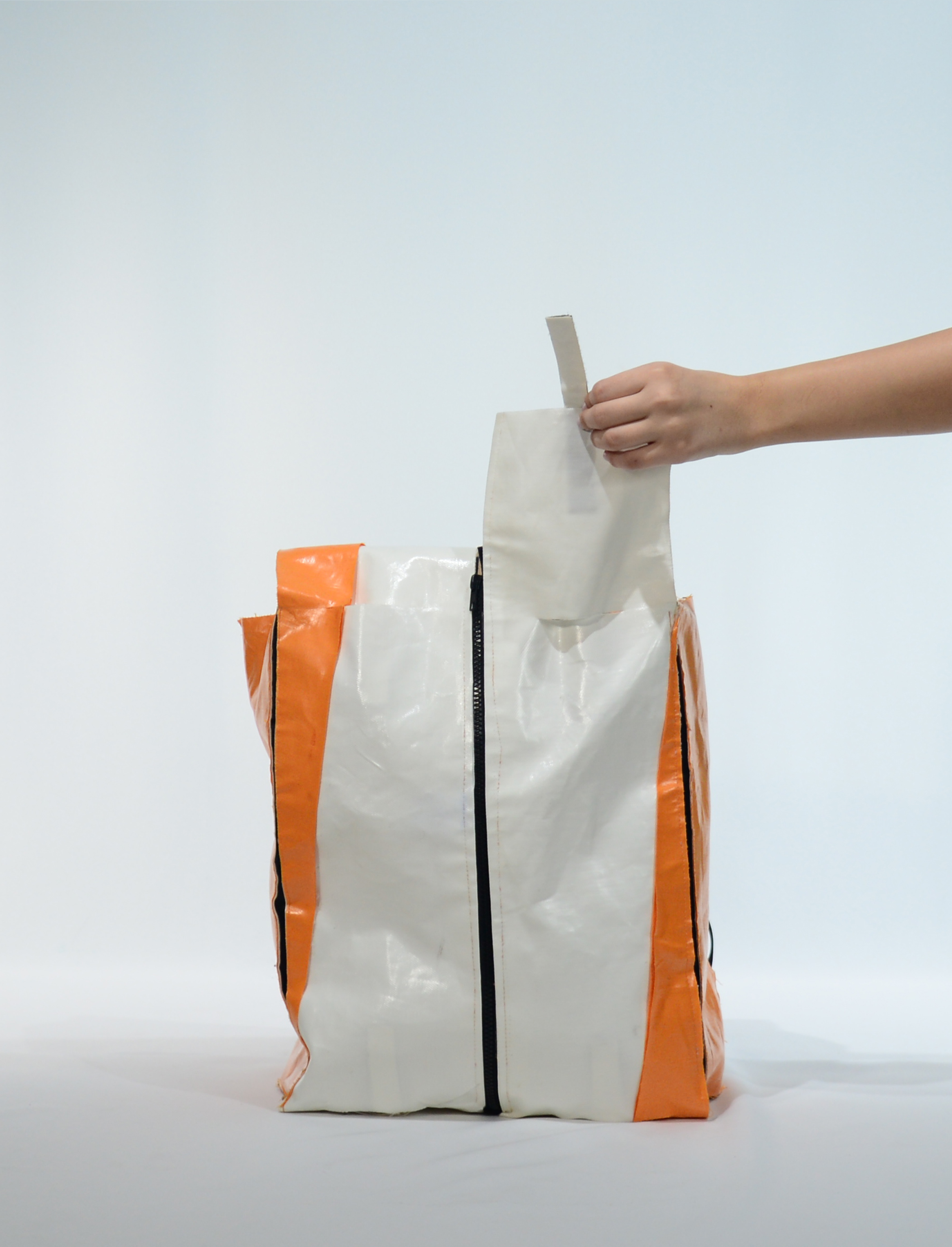
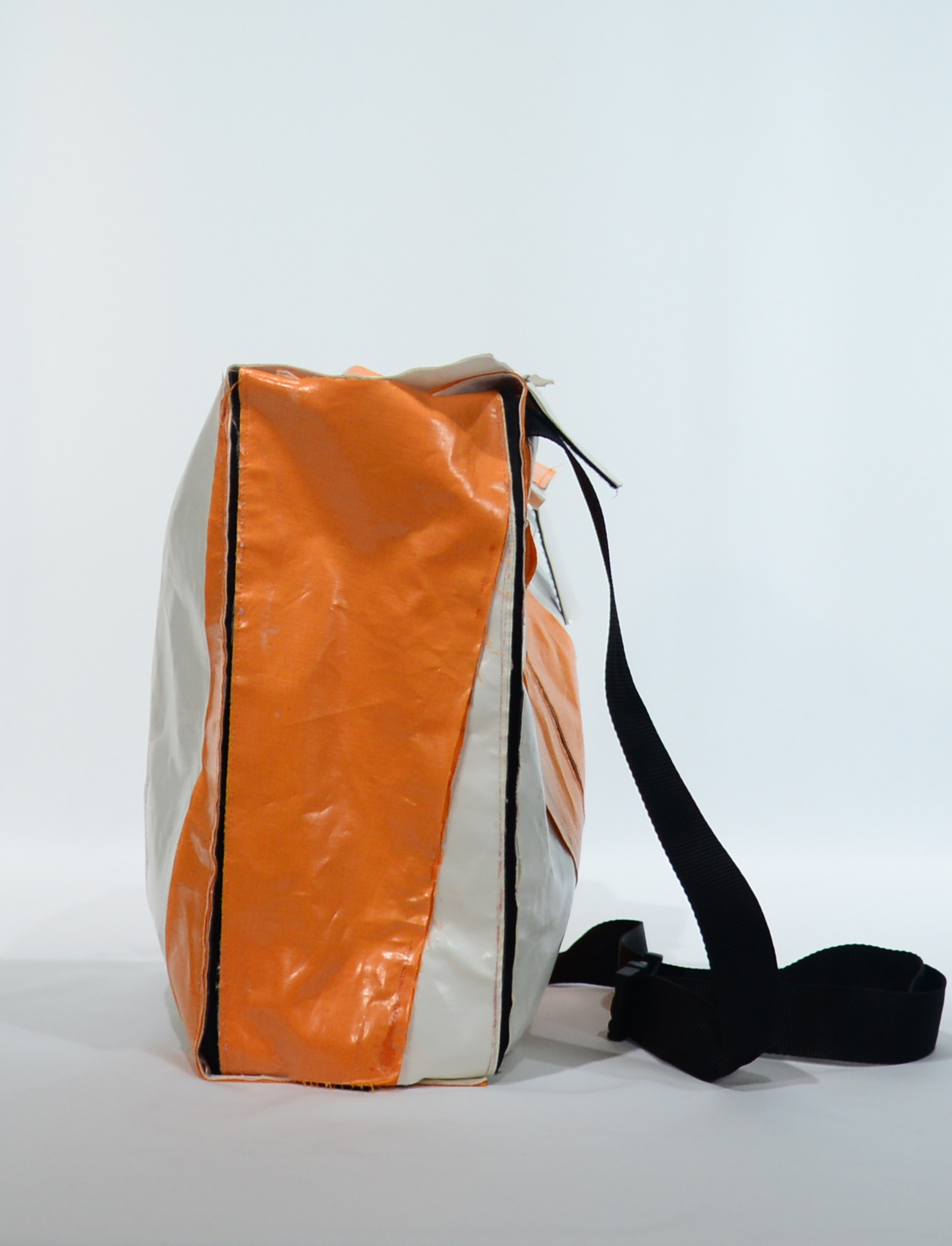
The oversizing of the letter, meaning introducing the letter at a much larger scale than what a person is accustomed to seeing it on a paper or screen of a computer through the action of reading, renders the graphic to be bold and achieves to dissociate it from its linguistic familiarity. The flatness of the letter further generates the immediacy in consumption and allows for the visibility of the simple seaming details. The linearity of the seams becomes a tool and a graphic. In a pursuit to showcase the graphic and take advantage of the flatness, the bag is worn as a backpack. Backpack is a type of bag that is closest to a billboard. Fixated on the back of a body, it falls against either the simpler surface of clothing or bare skin and has no “face” to compete with. The backpack becomes the face of the back of a body.
Vinyl, the choice of fabric in this project and also in billboard tarps, is integral to the execution and representation of the design. With the right amount of rigidity, the vinyl stays upright to carry on the language of flatness. Due to the material’s shiny-ness, it communicates the pop of the boldness and catches the eye quickly.
The choice of letters as the graphic upon the simple surface of a “box” is integral to the part-to-whole relationships that are aimed to be constructed in this design. The familiarity of whole letters facilitates the spectators to understand where the cut has been made as the letters used upon the bag represent only a portion of a “known” letter. The incentive behind cutting the letter is to explore the graphic quality of a linguistic element.
Letters are made out of the most basic and elemental components of a drawing: straight lines, diagonals, curves. Once taken advantage of this inherent geometric potential, letters, with tons of typefaces to choose from, enable elegant, bold, and compositional graphic. Once cut, they are freed from their expected quality that one can easily dismiss the geometric composition due to its familiarity and quick association.
Being exposed to only a portion of the letter forces the spectator to pay attention to its geometry and graphic quality.
In all these ways, the bag becomes a billboard. It is flat, bold, and large.
The oversizing of the letter, meaning introducing the letter at a much larger scale than what a person is accustomed to seeing it on a paper or screen of a computer through the action of reading, renders the graphic to be bold and achieves to dissociate it from its linguistic familiarity. The flatness of the letter further generates the immediacy in consumption and allows for the visibility of the simple seaming details. The linearity of the seams becomes a tool and a graphic. In a pursuit to showcase the graphic and take advantage of the flatness, the bag is worn as a backpack. Backpack is a type of bag that is closest to a billboard. Fixated on the back of a body, it falls against either the simpler surface of clothing or bare skin and has no “face” to compete with. The backpack becomes the face of the back of a body.
Vinyl, the choice of fabric in this project and also in billboard tarps, is integral to the execution and representation of the design. With the right amount of rigidity, the vinyl stays upright to carry on the language of flatness. Due to the material’s shiny-ness, it communicates the pop of the boldness and catches the eye quickly.
MELIS UGURLU ©2026 CONTACT︎︎